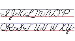
A handwriting style is a carefully designed, efficient way of forming letters and numbers. Each style has its own character or fits a certain need. The most common styles are shown here.
Most of these examples were created
with Startwrite Handwriting Software.
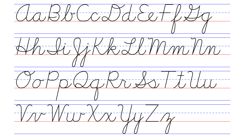
New American Cursive, handwriting style
New American Cursive
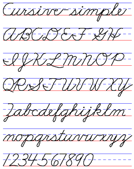
I like New American Cursive. This form of cursive is simple and clean. The child learns to write using cursive—they start with cursive. There is no manuscript form, although, the capital letters F, Q, T, and Z are made like manuscript capital letters. Another option would be to start a child with Zaner-Bloser Continuous Stroke Cursive.
Handwriting Without Tears, Printing - Handwriting Style
Handwriting Without Tears, Cursive - Handwriting Style
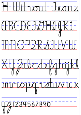
Handwriting Without Tears
Handwriting Without Tears is a simplified style, without a slant, and has a rather blocky feel to it. Developed by an occupational therapist, the program includes many tactile products for writing readiness and an app for memorizing letter form. It is popular in the United States, but I find it too simple. It is not beautiful and the cursive doesn't flow.
Printing - Handwriting Without Tears
Cursive - Handwriting Without Tears
Modern Manuscript (D'Nealian) - Handwriting Style
Modern Cursive (D'Nealian) - Handwriting Style
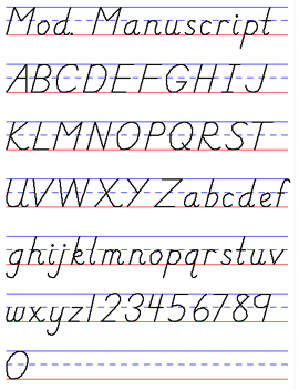
Modern Manuscript and Cursive (D'Nealian)
Modern Manuscript (D'Nealian) starts with slanted manuscript letters with the intent to transition easily to cursive writing. As in cursive writing, the lower case manuscript letters are made with one continuous stroke and most have "tails" (see the letter "a".) Modern Manuscript gained popularity in school districts in the United States in the late 1980's. Some find it challenging to teach (the program includes auditory instructions) and dislike the manuscript "b" and "k." I like it, but tend to teach it with modifications.
D’Nealian - manuscript and cursive chart
D’Nealian - manuscript only
SIMPLE Zaner-Bloser Manuscript - Handwriting Style
SIMPLE Zaner-Bloser Cursive - Handwriting Style
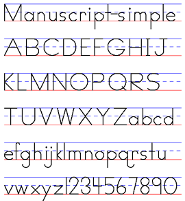
Zaner-Bloser Continuous Stroke (Simple)
This style is neither too challenging or too simple. Zaner-Bloser was the dominant handwriting style in the United States until Modern Manuscript (D’Nealian) gained popularity and this “continuous stroke” or “simplified” Zaner-Bloser was introduced. The continuous stroke applies to the manuscript letters—the pencil is not lifted to form a letter, as with the original Zaner-Bloser style. The cursive was simplified and most notable, the letter "Q" was changed to look like a letter "Q" instead of an odd number "2." Continuous Stroke makes sense—it is the closest thing to how Marie taught manuscript letter formation. When she taught cursive to first-graders, she used A Beka — that's what the private school chose.
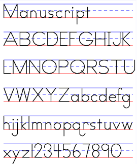
manuscript - uppercase & lowercase
Zaner-Bloser Manuscript, Handwriting Style,
Zaner-Bloser Cursive, Handwriting Style
Palmer Manuscript, Handwriting Style
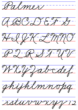
Palmer Cursive, Handwriting Style
Zaner-Bloser (Original) & Palmer
The original Zaner-Bloser style and the Palmer style are not used as much now.
manuscript - uppercase
manuscript - lowercase
cursive - uppercase
cursive - lowercase
Spanish
Peterson Handwriting
Peterson includes a transition between printing and cursive—it's called Slant Print. I don't have a sample to show here, but did include links to the site. Peterson's theme is "the difference is rhythm." The cursive letters end without a curve, much like the Italic styles. This program includes a depth of information, prompts and help. It seems like a lot of work, to me.
Print
Slant Print
Cursive
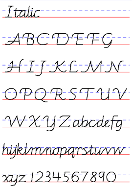
Italic Handwriting Styles
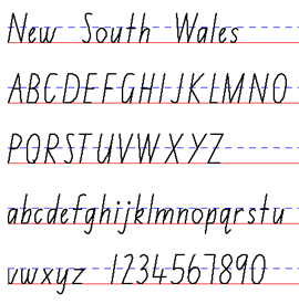
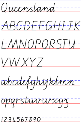
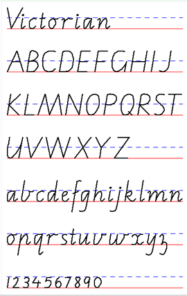
Italic is so lovely and appealing! There are a variety: Portland Italic, Barchowsky, New South Wales, Victorian, Queensland.
Italic charts (click “Chart” in the left-hand column)
Barchowsky Fluent

